Calgary Flames
Jersey Week Writers Roundtable: Favorite NON Flames Jersey
We’ve covering jersey stuff this week. It’s time to see if we like an other jerseys, besides the Flames, out there.
Writers Roundtable
We all know that we all love Flames jerseys here at the site. Heck you may have seen some of our jersey collections over the week. But do we like/have any other jersey OUTSIDE of the Calgary Flames? Dig in below to see what our writers like that isn’t red and yellow….or maybe we don’t like anything else and are Calgary-centric.
Mark: If you’ve been reading here for any amount of time you know I have a thing for hockey jerseys and uniforms overall. While I do love almost all of the Flames jerseys and have a decent collection, there are other jerseys that are just as nice.
Outside of Calgary two of my all time favorites are the Hartford Whalers and the 1980’s NJ Devils. Maybe I have a thing for green, but those are two of the NHL’s absolute best in my opinion. I currently own a Hartford Whalers road jersey with the “Pucky The Whale” patches on the shoulders. These were always a hit and I never understood why the Whalers ditched the shoulder patched and went to silver and navy blue. And in a quick and unapologetic rant: Carolina you are NOT the Whalers so stop wearing those uniforms. The Whalers died when they left Hartford.
As for the Devils. Sorry 1990’s where everyone went to a black colored uniform, the “Christmas” uniforms were the absolute best. The home white were nice, but the road red with the forest green just popped and was so classic. It’s too bad they bailed on them and only bring them out on occasion now because they were one of the best dressed teams in the league until the switch.
The only other non Flames jersey I own is a Sean Burke Phoenix Coyotes jersey. Burke was one of my favorite goalies growing up and I just like how those Coyotes jerseys looked. The simple maroon with the state patch and howling Coyote on the front is a very clean look. The ‘Yotes have always had decent uniforms, outside of those god awful Kachina uniforms.
I’m also a big proponent of bringing back the old black, white and orange NHL ASG jerseys that were worn in the early 1990’s. Maybe that’s me just waxing nostalgic because I grew up watching those games and some of my favorite Flames wore those beautiful jerseys.
Michael: Similar to Mark, Hartford’s jersey combinations have always been up there in my list of favourites. Their green is classic and I always like their navy blue iteration as well. I’ll choose some other ones for the sake of differentiation.
I’ll go with a few other past jerseys that I’ve really liked even though they might not have been the most popular at the time. First I’ll start with the Buffalo Sabres alternate jersey from the early 2000’s.
I’m not sure why exactly I like it so much, but I think it’s such a departure from their previous and current colour schemes that it really stood out. It was a strange decade or so when the Sabres went from blue and yellow to their red, silver, and black combination but this jersey was fire in my opinion at least.
Next up is a jersey I recently discovered as I was going through my old hockey card collection. I thought the purple in the Kings colour scheme always used to look really cool, although I understand why they transitioned back to the silver and black. I found this jersey which they wore from 2002-03 to 2006-07, and between the logo which was sick, the colour and striping, I think it’s a fantastic jersey.
Finally, a simple present-day jersey I like is the New York Rangers home jersey. It’s been around in one form or another for a long time and has a lot of what a classic hockey jersey should be in my opinion. It’s refined, with strong but not overpowering colours, a really solid design, and has stood the test of time. I especially also like how the numbering and lettering really pop on these jerseys.
Maddie: In general, I’m not really a huge jersey person, but for my favorite I’d have to go with Detroit’s, and their away jerseys, specifically.
I’m a big fan of this particular shade of red, and these are just so crisp. I don’t really have a very detailed breakdown on this, but I think these are just really sharp. They’re simple, but good simple, not trying too hard or anything like that. No need to mess with a good thing.
I think this exercise is also probably supposed to be limited to NHL jerseys, but I’m going to go rogue for a second here (and also show a little bit of bias).
I’m also kind of obsessed with these blackout jerseys that the Lehigh Valley Phantoms (the Flyers’ farm team) broke out this year as an alternate. They’re super cool, even if they were a nightmare to track before they changed the numbers from black with an orange outline to solid orange (but that was past Maddie’s problem). Either way, I still think these are lovely.
Gordie:
Two things this exercise has shown me is 1) I like yellow more than I thought and 2) I like new takes on old classics. The Blues Winter Classic jersey from 2017 is a throwback to their inaugural season in 1967-68. The photography technology wouldn’t have been good enough to properly credit them at the time, as the blue is especially easy on the eyes. Props to Jake Allen for doing the jerseys justice with a sweet set of pads.
I think these ones are a little more polarizing, and I can definitely see how the bright yellow would be too much for some people. I like the yellow/purple pallet and it’s truly devastating that the Kings abandoned it for the definitely nicer and not at all boring black and white scheme. The purple inverse of this jersey is just as nice in my opinion. Jonathon Quick does not get my props for not designing a pad set for these beauties.
Flash:
For me I’ve always loved two teams. The Flames coming alive when I was in grade 4 captured my heart, but so did the Maple Leafs as they graced my television every Saturday night. Back then home whites reigned supreme, and some of those jerseys were just iconic.
To this day the white Maple leaf With the extra fringe on the leaves stands out as an absolute favourite. It brings me back to spending afternoons after school playing road hockey with nobody but myself until the sun went down. A cup of hot chocolate when I finally came in and ate my cold supper (much time my mothers dismay). Memories, that bring joy back to my life every time I think of them.
Also I’d love to show a little love to a rival, the only team that could ever pull off an eggplant jersey. You guessed it, Quack Quack, I’m a sucker for the old Mighty Ducks of Anaheim jerseys. Iconic 90’s nostalgia bleeds out of me whenever I get a glimpse of one. Very good design that I’m still upset hasn’t made a comeback (Blasty first please)
by Mark Parkinson

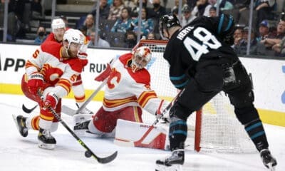

Battle of the Basement: Flames-Sharks Game Day Preview, Notes, How to Watch

Keeping Things Positive: Flames-Canucks Game Day Preview, Notes, How to Watch

Five Mind-Blowing Stats as Flames Become the Nate Diaz of the NHL

Craig Conroy Takes a Flyer on Trending Finnish Goaltender
